Pantone’s Leatrice Eiseman at Seattle Fashion Group International
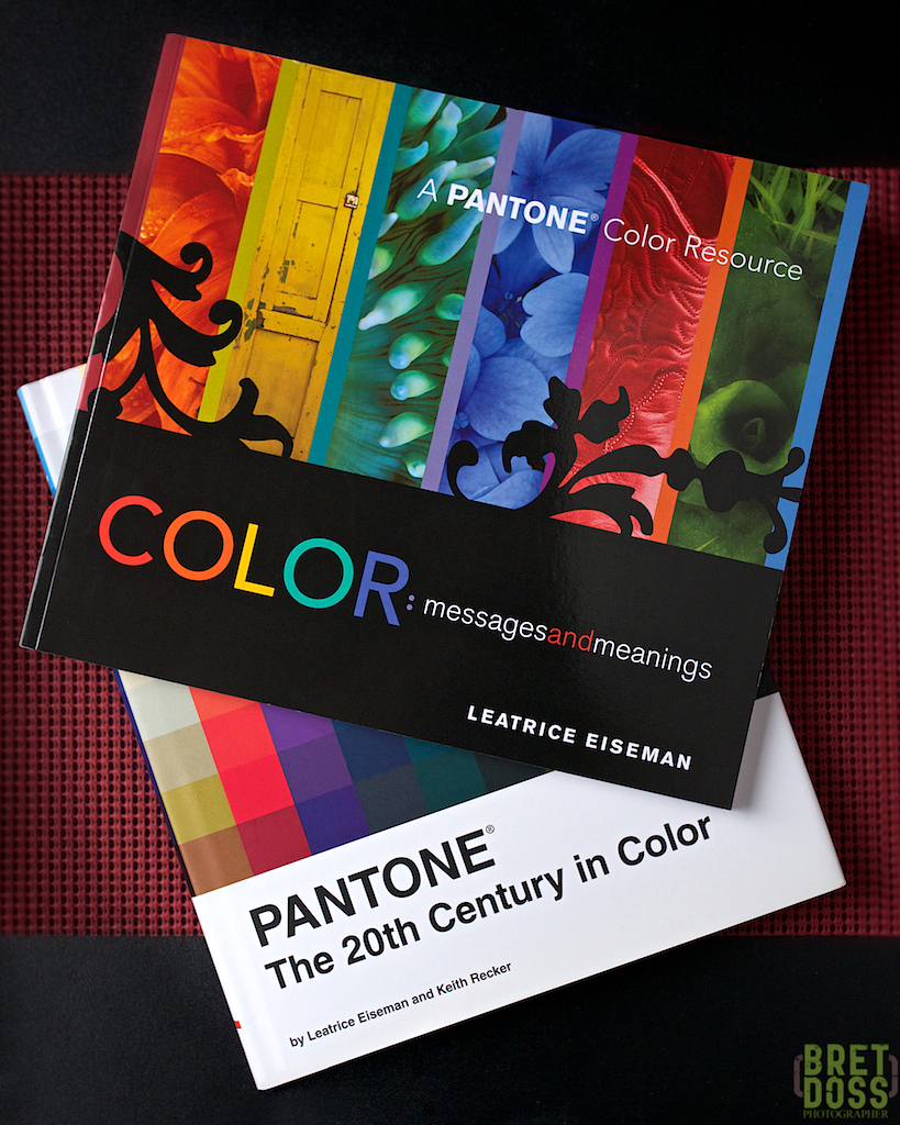
Two of Leatrice Eiseman’s books (my copies)
I am a photographer. I like to be behind the camera. In front of the camera? Not so much. Out of sight, off to the side, dressed to be inconspicuous, well, that is how I tend to approach large gatherings, if I approach them at all. I have to force myself to attend networking sorts of events for this reason.
However, sometimes just “showing up” turns out surprisingly well.
I’m a proud member of the Seattle Chapter of Fashion Group International, a valuable organization that, among other things, puts together events with interesting topics, presenters, & content. For the reasons stated above, I’m afraid I don’t attend nearly as many as I should.

image courtesy of L. Eiseman
When I received the invitation to their most recent event,‘A Conversation with International Color Guru – Leatrice Eiseman,’ I was intrigued. She is the executive director of the Pantone Color Institute, the author of eight books on color, and has a long list of achievements too numerous to list here.
They had me at “Pantone.”
Pantone is probably most well known for its color matching system, utilized by designers, manufacturers, printing houses, etc., to specify and duplicate colors independent of the methods used (paint, ink, dye, pigment). For example, if I were to say the green element of my logo is Pantone 5625 PC & the gray element is Warm Gray 8 PC (they likely aren’t for a reason I’ll get to in a bit), well, a printer could ensure my business cards had a precise color match, and if I needed a bunch of polo shirts or baseball caps in those colors, a less precise but acceptable ‘commercial match’ should be easily enough achieved.
Bit of a sidetrack here, but it is relevant to the story. One of my first jobs was at a company that provided one of many products from several suppliers to our customer—all of which had to match in color when mounted next to each other in the end product. We had master color chips from our customer, and an incoming inspection department to check that the panels we purchased were a good match.
I received a call: the inspector was up in arms. A large delivery had arrived and the color didn’t match. They had to be rejected and replaced. This sort of thing requires–you guessed it–paperwork. You are probably ahead of me by now: yes, it was my job to write up the paperwork. Part of that wonderful filling-out-of-forms was to include my signature, asserting my concurrence with the inspector’s assessment. Easy enough, right?
So I hustled on down to the inspection area, ready to put eyes on the problem, concur, and finish the forms. Except I could not see the difference. The inspector looked at me with a bit of defensive astonishment: was I disputing her assessment? How could I not see the difference between the master color chip and the panel in her hand? She switched several different color temperature lights on and off in sequence, and from her gasps and sighs (and rolling of eyes) it was apparent that the difference was increasingly more and more obvious—to her. Only in one type of lighting was I able to detect what seemed to be an insignificant difference. She called over two other inspectors and each, in turn, said she could easily see the difference.
As you may know, there is generally a difference in the anatomy of the male and female eye: women tend to have more “cone” receptors than men, and therefore are more sensitive to color than men. In fact, our customer had wording in our contract that the color matching inspectors could only be women. (This was long before computer-based color matching/measurement was affordably available. I was three years old. I filled out the rejection forms with crayons. That is my story, and I am sticking to it!).
Which is a roundabout way of saying that, nope, don’t bet money on my statement about my logo color, as it is based upon a post-logo-creation-using-my-eyeball-match to a Pantone color card. It is also a roundabout way of saying that I know I have limitations when it comes to color. Which is a further roundabout way of saying I was interested to know more, and Leatrice Eiseman is a world-reknowned expert in color.
Any photographer (and most especially yours truly) can always stand to learn more about color, color theory, the psychology of color, the prediction of and reasons for color trends.
Now that is a lot to ask of an evening’s presentation. Leatrice managed to touch on all of those topics and more.
One hot topic was Pantone’s Color of the Year. Near the end of each year, Pantone announces the Color of the Year for the upcoming year. This year it was Emerald. Next year’s is—we’ll know in December. Leatrice already knows. She is on the committee that makes the determination.
[Update: Dec 5, 2013 — Just announced, Pantone’s Color of the Year for 2014 is Radiant Orchid]
Notice that I said ‘determination’ and not ‘decision.’ If you are like me, you might have assumed that the color of the year is arrived at in something like the proverbial smoke-filled room by a group of product manufacturers and designers with a huge financial interest in ‘creating’ the next trend, so that there would be a fabricated need for consumers to purchase products in the new color palettes each year. If you are like me, you couldn’t be more wrong! (If you are even more like me, you are probably used to often being wrong….).
Hard work, research, data gathering, supplemented by a breadth and depth of knowledge of the history of color, the technology of color, the usage of color, the psychology of color all whirl together to yield a best prediction for the color of the year selection.
Far from a superfluous Groundhog Day sort of weather prediction, the Color of the Year prediction is crucially important to many businesses, industries, brands, designers, etc.. Because it is such a well-researched, well-founded prediction, it may be relied upon.
Leatrice described some of the effort and data needed for the task. Data about the usage of colors over the many past decades, the timing, duration, cycles for colors is crucial. Some colors trend up and down in popularity on fairly regular cycles, while some are fairly stable and vary less. Others have very short lives. Still others seem to have come out of nowhere. So, for 2014, what cycles may be due for a new peak?
A surprise to me was Technology as a driver for color trends: our eyes will naturally be drawn to something new and different. If we respond positively to it, we’ll likely want more of it. Technology changes fast, and new things move from only-imagined to mass-production in shorter time spans with regularity. Leatrice noted that good leading indicators for future color availability/desirability could be found in automakers’ concept cars, nail polish, and high-end jewelry!
The color schemes of concept cars will often be created with advanced color technology. While these concept cars themselves may never reach production, the paint colors might. If not on cars, the new colors made possible by advances in technology can migrate to other products. Similar effects of new nail polish colors and high-end jewelry can be found, along with a resulting consumer demand for those palettes.
The committee also spends time and energy consulting and querying designers, textile producers, and others around the world. Textile manufacturing technology advances may make new colors possible, or more easily produced. An unplanned surge of a particular color may simply surface one year: manufacturers find themselves suddenly able to produce something new and different, and there is a response by the users/consumers to support it.
Creatives in every industry, business, and art form will always be looking for something new, something to keep moving forward and avoid stagnation. When these choices and discoveries demonstrate a tendency to converge, perhaps a Color of the Year is more easily predicted.
This prediction is without agenda.
Leatrice was emphatic on this point: she does not hold with the idea that fashions or a color of the year announcement should cause us to abandon colors we love for any reason, least of all to simply be ‘on trend’. While it is most certainly true that companies market products to us on that basis, Leatrice noted that she feels strongly that color is a personal choice, and has meaning for each of us well beyond any artificial marketing ploy.
Her background in the psychology of color is no doubt a factor: in her book “Color: messages and meanings” she explains the effects of color. Since my logo is green & gray by my choice, let’s take a look into it:
I chose green & gray for some conscious reasons:
- I like green. I like gray.
- I lived in the desert southwest for more than 25 years (not a very green place)
- I moved to the Pacific Northwest several years ago, and am in love with it.
- Here, there are perhaps a million shades of green visible every day. Even in winter, when the deciduous leaves fall, the evergreens are omnipresent, the mild rainy climate keeps the grass green, and so the occasional snowfalls land on green grass and trees.
- The green landscape and the often overcast, blue-gray light are very relaxing to me.
- There is water everywhere: Puget Sound, lakes, streams, rivers, creeks, and rain.
- Rain. I love rain. When I lived in the desert southwest, rain meant green growth. Short-lived, perhaps, but a sudden burst of green on the landscape.
- Fog. I love fog. When I lived in the southwest, fog was fragile, rare, and transient, gone at the lightest hint of a breeze. In Seattle, fog can be dense, last for days, and continuously moving with the wind.
- Seattle is the Emerald City.
All of those factors played into my choice of green on some level. My choice was made long before meeting Leatrice or reading her book.
Now, let’s see what she writes:
“An abundance of green indicates that there is an abundance of water—so necessary for survival. As a result, humans respond on a very visceral level to the reassuring presence of green”
“Physiologically, green affects the nervous system, causing us to breath slowly and deeply….”
Green is “the most soothing color to the eye” and “the most balanced color in the spectrum.”
I can’t say with any certainty that I chose my logo/brand colors “wisely” but I did choose them based on things that affect & reflect me.
The books shown in this post are my personal copies, purchased immediately upon returning home from her presentation. I highly recommend them, as well as attending her presentations should the opportunity arise. I’m looking into her course schedules–I’m likely as not going to be attending her next Seattle-area offering.
Resource Links:

I always spent my half an hour to read this weblog’s content daily
along with a cup of coffee.
Great site you have here but I was wondering if
you knew of any discussion boards that cover the same topics discussed here?
I’d really love to be a part of group where I can get suggestions from other experienced people that
share the same interest. If you have any recommendations,
please let me know. Appreciate it!
Hmm it looks like your site ate my first comment (it was super long) so I guess I’ll just sum it up what I submitted and say, I’m thoroughly enjoying your blog.
I too am an aspiring blog blogger but I’m still new to the
whole thing. Do you have any recommendations
for rookie blog writers? I’d definitely appreciate it.