Violin

image © Bret Doss, All Rights Reserved
The concept for this assignment was to mock up a cd cover for a classical quartet: the music is OP 11 by composer Samuel Barber. My first step was to listen to the piece to discover the mood and imagery it induced in me. I ordered the sheet music, thinking to use an image of the notes in some manner. But what struck me the most was the graphic of Samuel Barber’s signature, just the initials SB. I saw a bit of a violin-complementing shape to his signature, and knew I had to incorporate that into the project.
I obtained a violin (I actually obtained two, the second is a more light, white-ish stained wood, but it did not fit the mood and feel of the music). For this shoot, I wanted to use an ‘improvisation’ approach, spending time simply shooting the violin from multiple angles, with shifts in lighting, etc. as they came to me. Basically, no preconceptions, just moving around the violin and seeing it thru the lens, shooting every and any aspect of it that moved me. I clamped it carefully at its base, and extended it from a light stand at about shoulder height (where it would naturally be). I could move all around it, as well as above and below. I didn’t use my usual studio strobes, as for this I wanted to see it as it was and capture the image directly in a more organic, fluid way. My continuous LED lighting (normally for video) was ideally suited to this intention.
Darkening the studio and keeping the background dark provided a subtle sense of being on-stage, and the light was close enough to provide sufficient illumination while being far enough back to cast shadows, as might be seen in spotlighting on a stage.
Since the only preconception about images was that I wanted to incorporate Samuel Barber’s initials into the cd cover mockup, I sought that image first, and it is the image you see above. Negative space allows for the quartet’s name to be included on the cover by the art director (and the removal of the initials at the art director’s discretion, as well).
I moved around, above, and below the violin, occasionally rolling the light stand or the violin into slightly different positions for the angle I was photographing. I spent a fair amount of time just shooting whatever details caught my eye and demanded my attention. Using a macro lens kept me close, intimate (I could reach out and touch the violin at any time), and that intimacy was part of what I wanted to convey in the images.
I selected two additional images to complete the mock up.

image © Bret Doss, All Rights Reserved
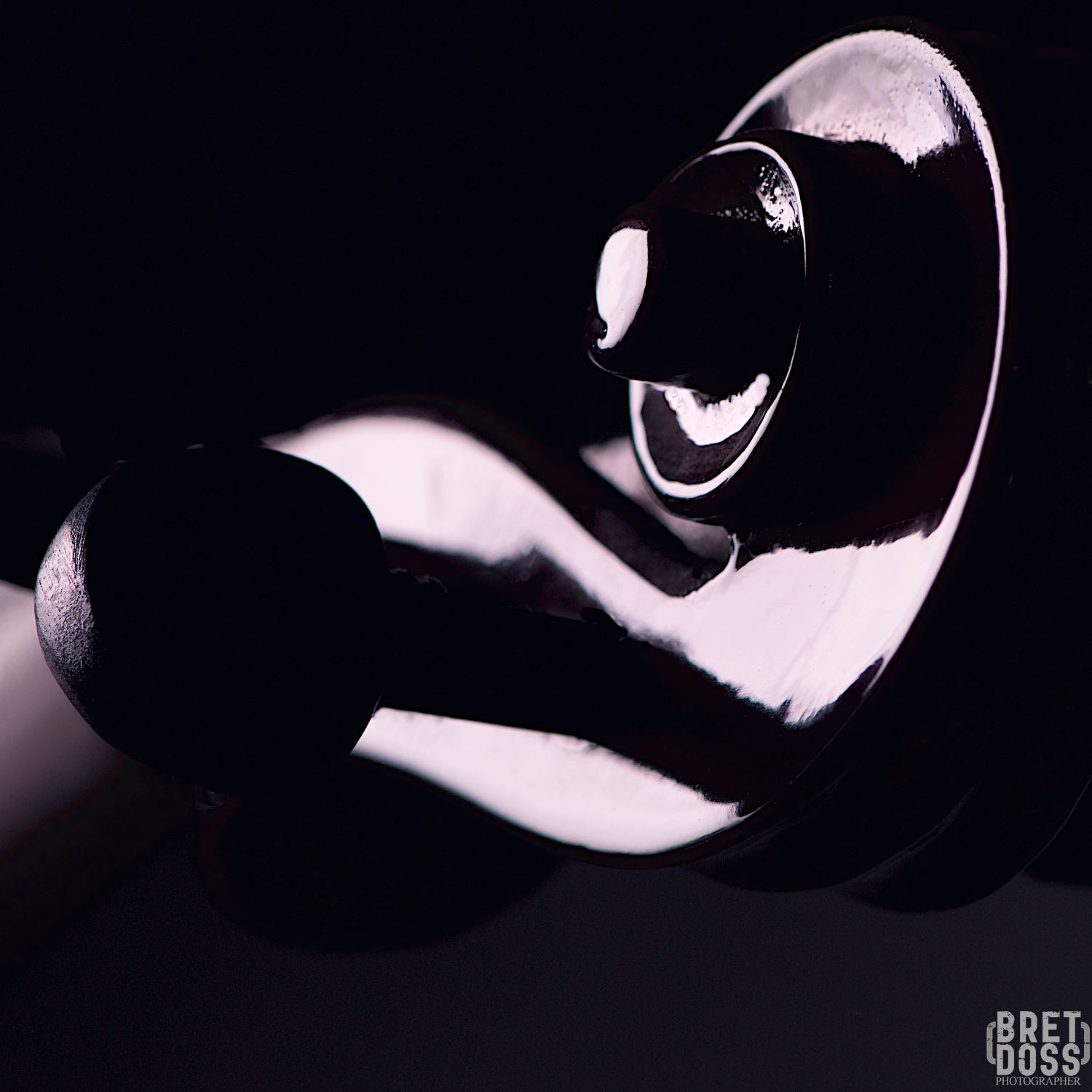
image © Bret Doss, All Rights Reserved
Here is the final mock up, with the initial graphics included. The left image would be the back cover, with negative space available for text. The middle image would be the front cover, and the image on the right would be the inside cover, after folding.

image © Bret Doss, All Rights Reserved
Below are some other images from the shoot, as well as some black and white interpretations. Which are your favorites?

image © Bret Doss, All Rights Reserved
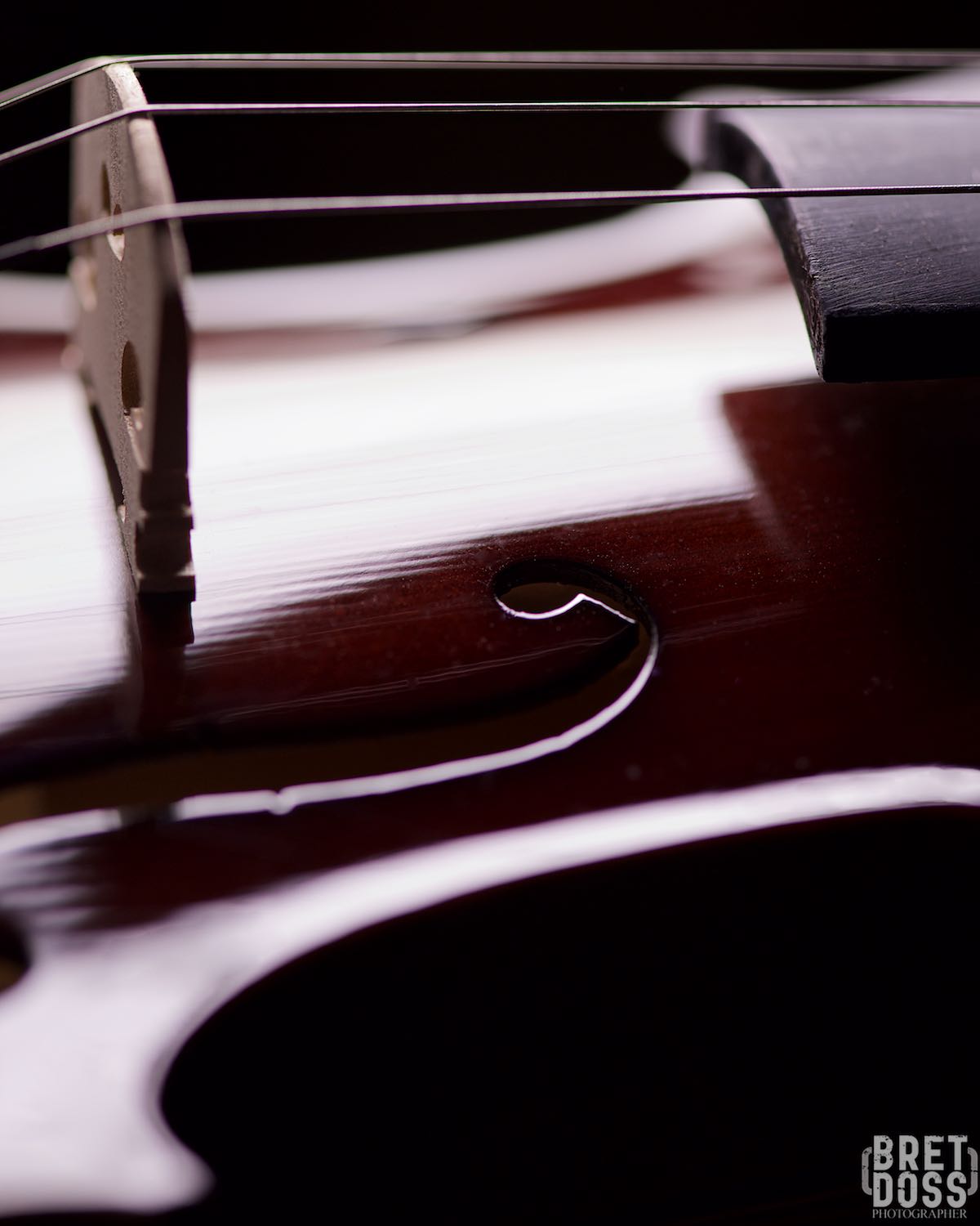
image © Bret Doss, All Rights Reserved
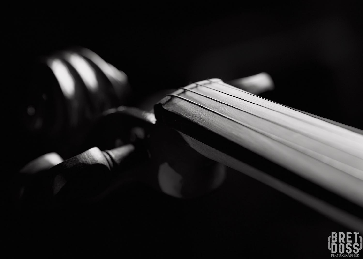
image © Bret Doss, All Rights Reserved

image © Bret Doss, All Rights Reserved

image © Bret Doss, All Rights Reserved

image © Bret Doss, All Rights Reserved
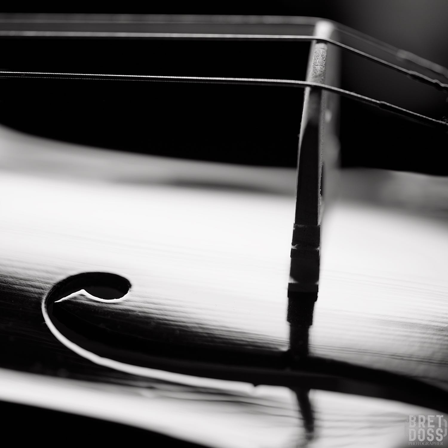
image © Bret Doss, All Rights Reserved
all images/content © Bret Doss, all rights reserved

Leave a Reply